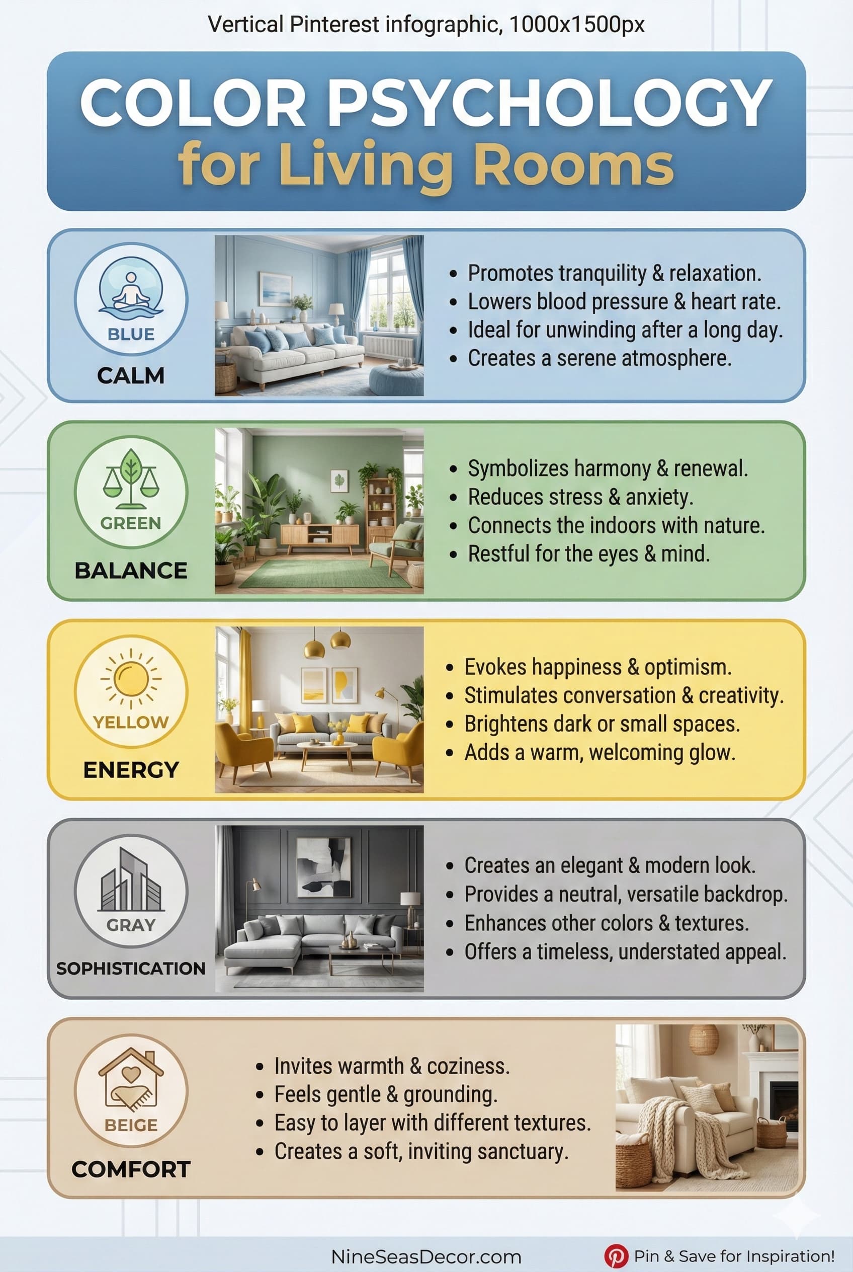
Color psychology, the science of how colors affect human behavior, emotions, and mood, provides essential foundation for choosing living room colors that support how you actually use the space. Different colors trigger distinct psychological responses, making some perfect for relaxation while others energize or stimulate conversation.
Blue consistently ranks as the most universally calming color, lowering blood pressure and heart rate while promoting relaxation and tranquility, ideal for living rooms where you want peaceful unwinding after stressful days. Soft blues like powder blue, sky blue, or pale aqua work beautifully in living rooms receiving abundant natural light, while deeper navy blues create sophisticated elegance in formal spaces. Consider Sherwin-Williams Naval (SW 6244) or Benjamin Moore Hale Navy (HC-154) for dramatic depth, or Behr Light French Gray (N450-1) for softer approaches.
Green connects us to nature, promoting balance, harmony, and restoration while reducing eye strain, particularly valuable in living rooms where screens dominate entertainment. Sage green, olive green, forest green, and mint green all bring organic tranquility indoors, pairing beautifully with natural materials like wood, rattan, and stone. Popular choices include In paint color recommendations Evergreen Fog (SW 9130), their 2022 Color of the Year that remains trending, and Benjamin Moore Saybrook Sage (HC-114).
Warm colors, reds, oranges, yellows, stimulate conversation, appetite, and social interaction, making them excellent accent colors in living rooms where families gather and entertain guests. However, use these energizing colors judiciously, bright red walls throughout can feel overwhelming, while terracotta orange or soft yellow creates warmth without intensity. Sherwin-Williams Cavern Clay (SW 7701) delivers earthy warmth, while Benjamin Moore Golden Honey (297) adds cheerful sunshine.
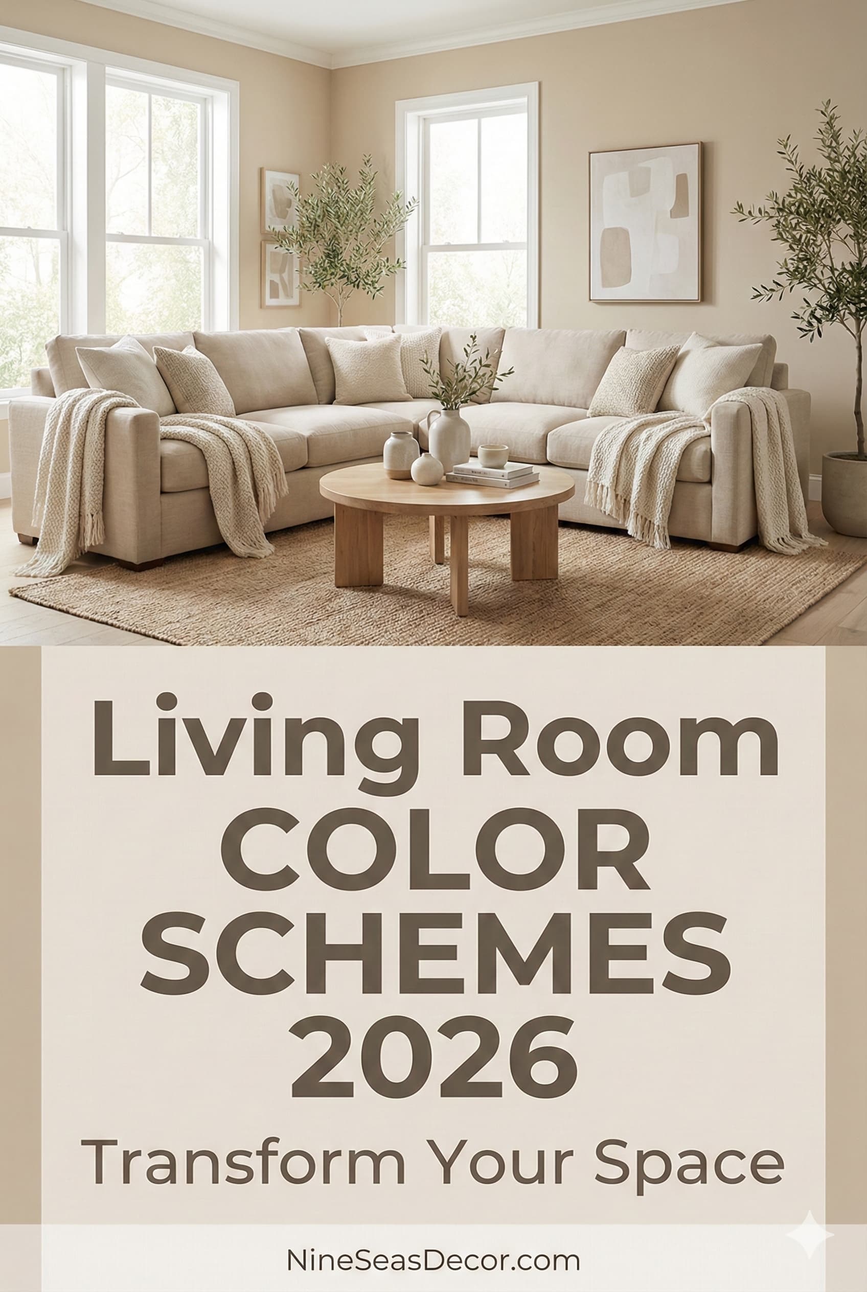
Neutral colors, whites, beiges, grays, provide psychological flexibility, creating calm backgrounds allowing your mind to rest while not influencing mood dramatically in either direction. This versatility explains why neutral living room colors dominate interior design, they support any lifestyle, accommodate changing furniture and décor preferences, and never feel dated or limiting.
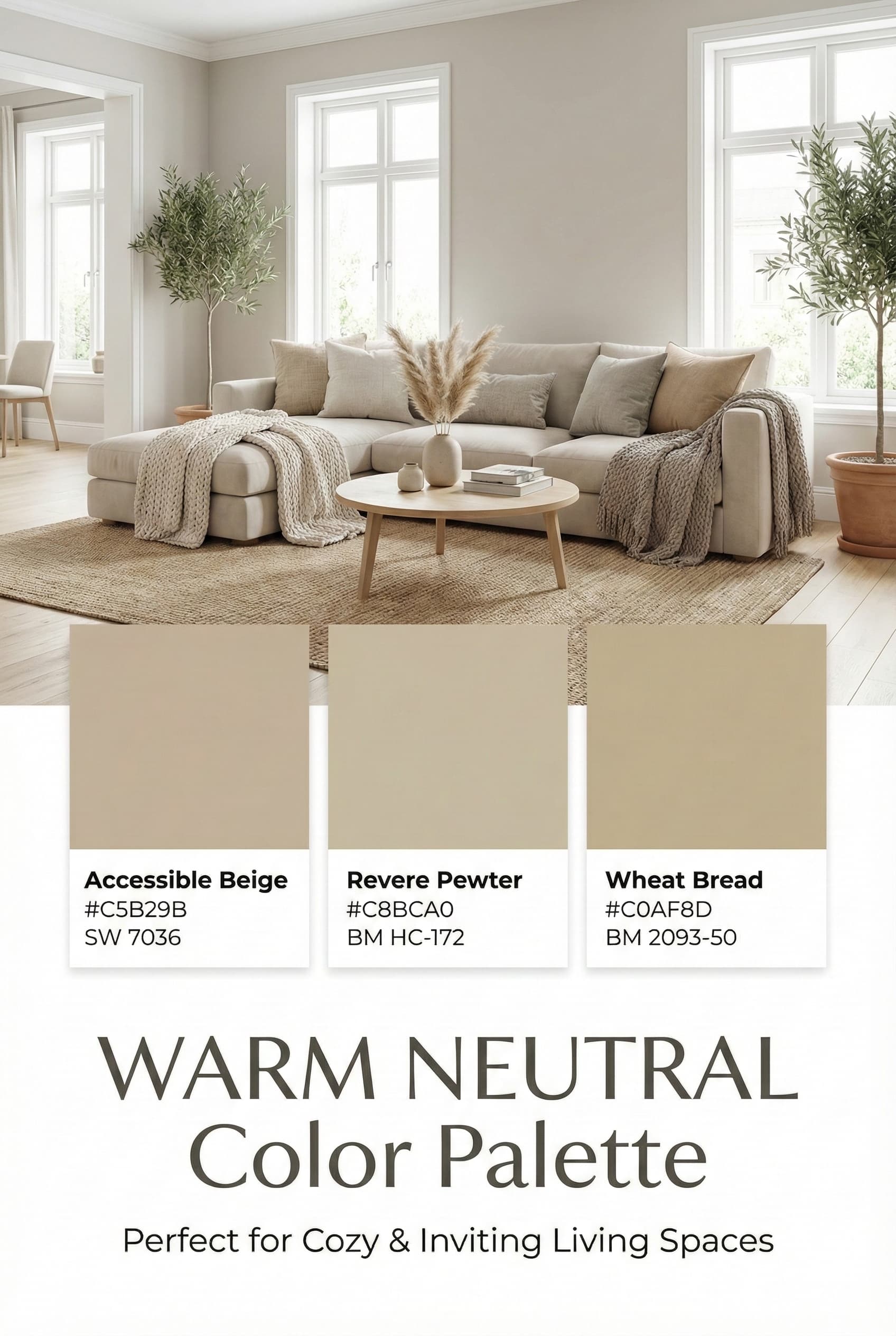
Neutral color schemes, built around whites, beiges, grays, taupes, and soft browns, remain eternally popular for living rooms because they create calm, versatile backdrops allowing furniture, art, and décor to shine while never going out of style or limiting future decorating flexibility. Successful neutral schemes require layering multiple tones creating depth rather than using single flat beige throughout.
Warm Neutral Palettes
Warm neutrals including greige (gray-beige blend), warm whites with cream undertones, soft taupes, and sandy beiges create cozy, inviting atmospheres perfect for living rooms where families gather. These colors work particularly well in north-facing rooms lacking warm natural light, compensating with inherent warmth that cool grays and crisp whites simply can’t provide.
Popular warm neutral paint colors for 2026 include Sherwin-Williams Accessible Beige (SW 7036), one of their most popular colors Benjamin Moore paint collections Revere Pewter (HC-172) which beautifully shifts between gray and beige depending on lighting, and Behr Wheat Bread (N250-2) offering soft sandy warmth. These versatile shades pair beautifully with natural wood furniture, brass or gold metallic accents, and warm-toned textiles creating cohesive, sophisticated spaces.
Layer multiple warm neutral tones rather than using single beige throughout, try warm white walls with greige sofas, taupe accent chairs, and sandy beige area rugs. This creates depth and visual interest that monochromatic approaches lack. Add texture through linen curtains, velvet pillows, wool throws, and natural fiber rugs ensuring visual richness despite minimal color variation.
Pair warm neutrals with accent colors like dusty rose, sage green, or soft terracotta introducing personality without overwhelming the calm neutral foundation. Use the 60-30-10 rule: 60% main neutral (walls), 30% secondary neutral (furniture), 10% accent color (pillows, art, accessories).
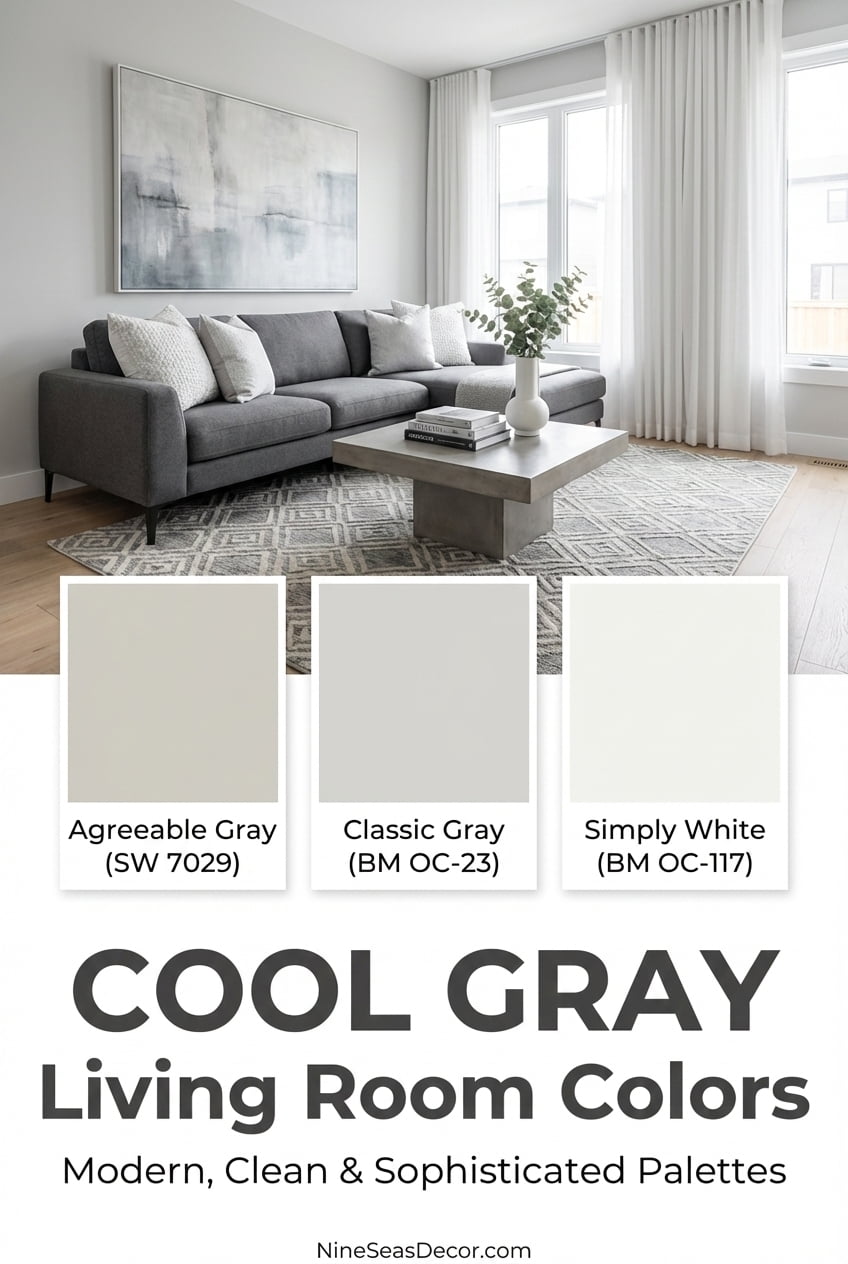
Cool Neutral Palettes
Cool neutrals, grays, crisp whites, and gray-tinged taupes, create fresh, modern aesthetics perfect for contemporary living rooms or spaces receiving warm southern or western light where cooling tones feel refreshing. These colors make rooms feel clean, spacious, and sophisticated while providing perfect backgrounds for bold artwork or colorful furniture.
Top cool neutral paint colors include Sherwin-Williams Agreeable Gray (SW 7029), an incredibly popular choice despite “gray” in the name as it reads quite warm, Benjamin Moore Classic Gray (1548) for true medium gray, and Behr Silver Drop (N520-1) for lighter approaches. For crisp white, Benjamin Moore Simply White (OC-117) delivers clean brightness without stark coldness.
Cool gray living rooms benefit tremendously from warm wood tones preventing sterile institutional feelings. Pair cool gray walls with honey oak, walnut, or teak furniture introducing necessary warmth. Add brass or gold metallic accents, lighting fixtures, mirror frames, decorative objects, creating luxurious contrast against cool tones
Introduce texture aggressively in cool neutral schemes, without warm color variation, texture provides essential visual interest. Mix smooth leather sofas, nubby linen pillows, chunky knit throws, shaggy rugs, and varied metallic finishes creating tactile richness compensating for color restraint.
While neutrals dominate residential design, bold dramatic colors create memorable, personality-filled living rooms reflecting confident design choices and strong personal style. Successful bold color schemes require balancing intensity with breathing room, using dramatic colors strategically rather than overwhelming entire spaces.
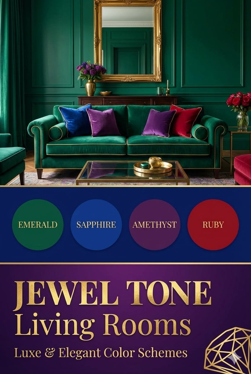
Deep Jewel Tones
Jewel tones, emerald green, sapphire blue, amethyst purple, ruby red, bring luxurious richness to living rooms, particularly effective in formal spaces or rooms used primarily for evening entertainment where dramatic colors shine under artificial lighting. These saturated colors work best in larger living rooms (250+ square feet) where they won’t feel claustrophobic.
Sherwin-Williams Evergreen (SW 0053) delivers deep forest sophistication, while Benjamin Moore Deep Royal (2061-20) creates dramatic navy elegance. For burgundy richness, try Sherwin-Williams Red Bay (SW 6321). Paint all four walls in your chosen jewel tone for immersive drama, or designate one accent wall maintaining neutral tones elsewhere.
Balance jewel tone walls with lighter furniture, cream, beige, or light gray sofas and chairs preventing rooms from feeling cave-like. Add brass, gold, or copper metallic accents amplifying luxurious atmosphere. Velvet upholstery enhances jewel tone schemes beautifully, with plush texture complementing rich colors perfectly.
Ensure adequate lighting in jewel tone living rooms, these dark colors absorb light requiring layered illumination from floor lamps, table lamps, and overhead fixtures. Use warm-toned LED bulbs (2700-3000K) enhancing richness rather than cool bulbs making colors feel muddy.
Charcoal and Black
Charcoal gray and even black create surprisingly sophisticated living room schemes when executed properly, these dramatic darks make rooms feel cozy, intimate, and contemporary while providing stunning backdrops for art and lighting. This trend gained momentum in 2024-2025 and continues strong into 2026.
Sherwin-Williams Iron Ore (SW 7069) delivers deep charcoal without absolute blackness, while Benjamin Moore Black (2132-10) provides true deep black for maximum drama. Use these dark colors in living rooms with excellent natural light preventing oppressive feelings, south or west-facing rooms work best.
Paint ceilings in these schemes white or very light gray preventing cave-like compression. The contrast between dark walls and white ceilings adds architectural interest while maintaining airiness. Consider painting trim, molding, and built-ins in matching dark tones for modern seamless looks, or crisp white for traditional contrast.
Incorporate abundant white, cream, or light gray in furniture and rugs balancing darkness. Add warmth through natural wood coffee tables, warm brass lighting, and organic textures preventing cold industrial feelings. Plants provide essential life and color contrast against dark backgrounds.
Two-tone color schemes, using two distinct colors in coordinated ways, create visual interest, define architectural features, and allow incorporating both favorite colors without commitment to single choices. This approach works beautifully in living rooms with interesting architecture to highlight or open floor plans requiring visual definition.
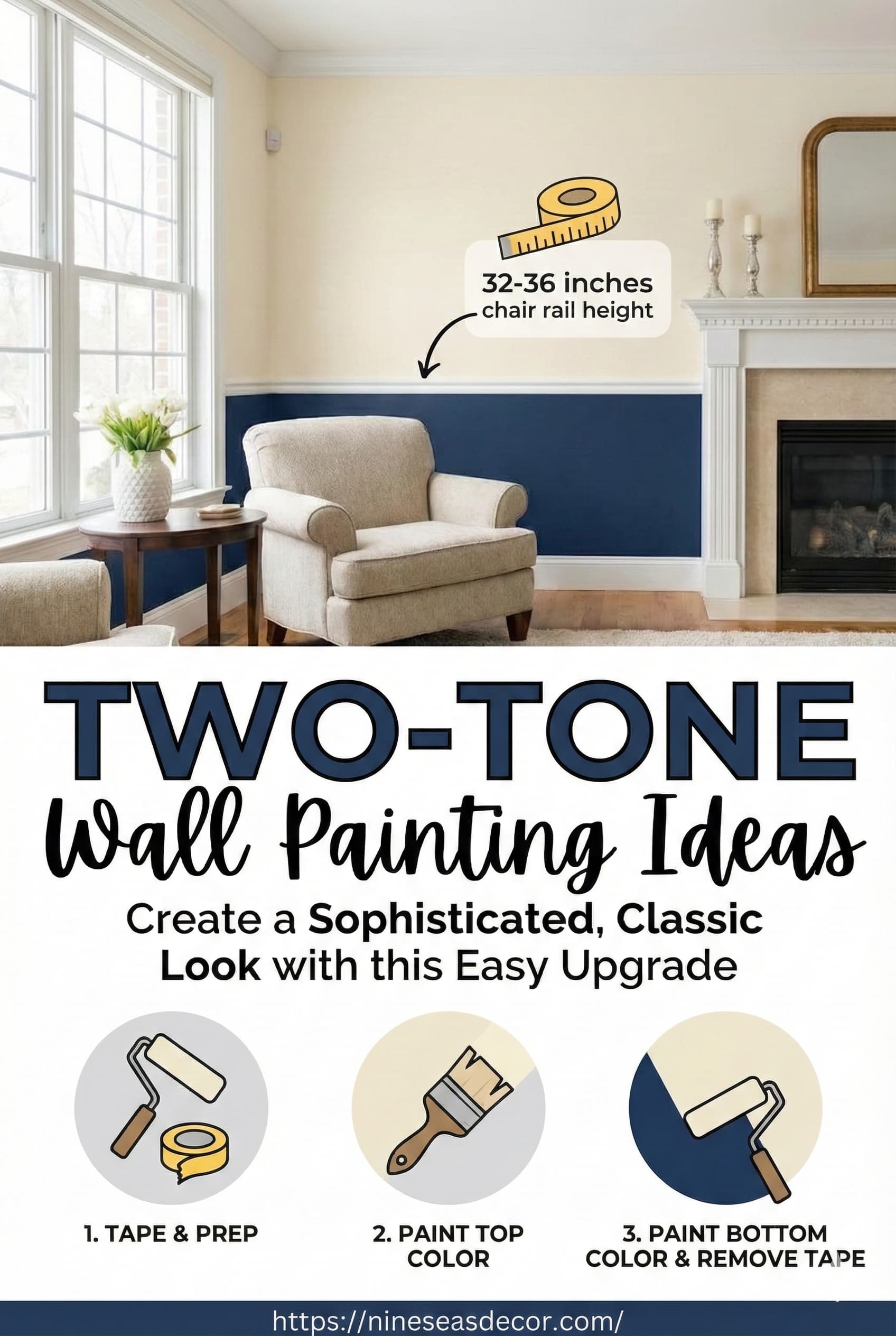
Horizontal Division
Horizontal two-tone schemes divide walls into upper and lower sections, typically using chair rail molding as division point roughly 32-36 inches from the floor, painting sections different colors. This classic approach adds traditional elegance while making tall ceilings feel less imposing or short ceilings appear higher depending on execution.
Paint lower sections in darker tones (navy, charcoal, deep green) with lighter upper sections (white, cream, light gray) creating grounded, sophisticated looks perfect for traditional or transitional living rooms. This configuration hides scuff marks near floors while maintaining airiness above eye level.
Alternatively, reverse the formula painting upper sections darker, this draws eyes upward making ceilings feel taller while creating dramatic contemporary effects. Use this approach carefully in rooms with low ceilings (under 8 feet) as it can sometimes compress spaces.
Choose colors with clear relationship, analogous colors (neighbors on color wheel like blue and green), complementary colors (opposites like navy and rust), or different saturations of same color (light blue with navy). Avoid randomly paired colors creating disjointed, confused effects.
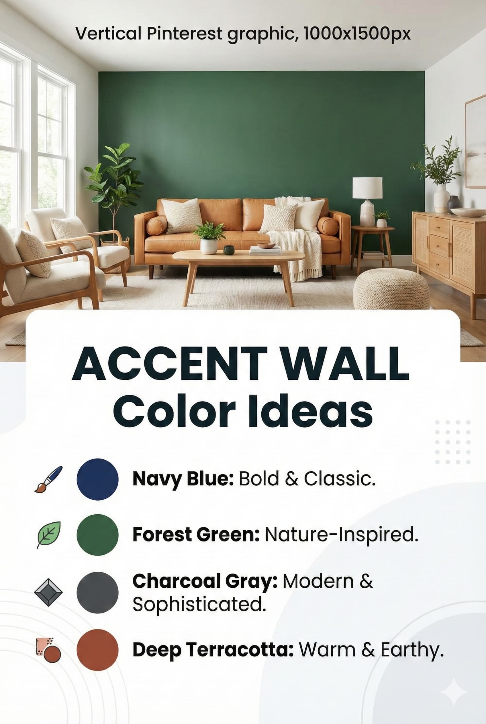
Accent Wall Strategies
Accent walls, painting one wall different color while keeping remaining walls neutral, rank among the most popular two-tone approaches, offering bold color without overwhelming commitment. Wall selection determines to accent, this decision impacts entire room flow and focal point.
Paint the wall behind your sofa creating instant focal point and backdrop for seating arrangements. This works particularly well with deep colors like navy, forest green, or charcoal, the sofa breaks up the dark color preventing overwhelming feelings while creating dramatic contrast. Alternatively, paint the wall facing the room’s main entry creating immediate impact as guests arrive.
If your living room features fireplace, built-ins, or architectural interest, accent that wall highlighting existing features. The color draws attention to design elements while creating cohesive composition, paint both the wall and built-ins in matching colors or contrast them depending on desired effect.
Avoid accenting walls with windows unless you want to emphasize views, colored walls around windows sometimes compete with natural vistas. Similarly, avoid accenting walls with multiple doors or openings as the color gets chopped up appearing disjointed.
Monochromatic schemes, using single color in varying shades, tints, and tones, create sophisticated, cohesive living rooms with built-in harmony since all colors relate by definition. This approach suits both bold color lovers (imagine all blues from pale sky to deep navy) and neutral enthusiasts (layered beiges, taupes, and browns).
Choose your base color considering psychology and lighting, blue monochromatic schemes feel calm and serene, green feels natural and restorative, gray feels modern and sophisticated. Use the lightest tint on walls (pale blue, soft sage, light gray) as foundation, medium tones in furniture upholstery and rugs, and deepest shades in accent pieces, pillows, and artwork.
Add depth through texture rather than color variation, since monochromatic schemes limit color range, texture becomes crucial for visual interest. Mix smooth leather, nubby linen, plush velvet, chunky knits, and glossy surfaces creating tactile richness compensating for color restraint.
Introduce neutral white, cream, or black as grounding element preventing monotony, white trim, black accent furniture, or cream rugs provide visual rest from continuous color while maintaining cohesive scheme. Metallic accents in brass, gold, chrome, or bronze add sophisticated punctuation.
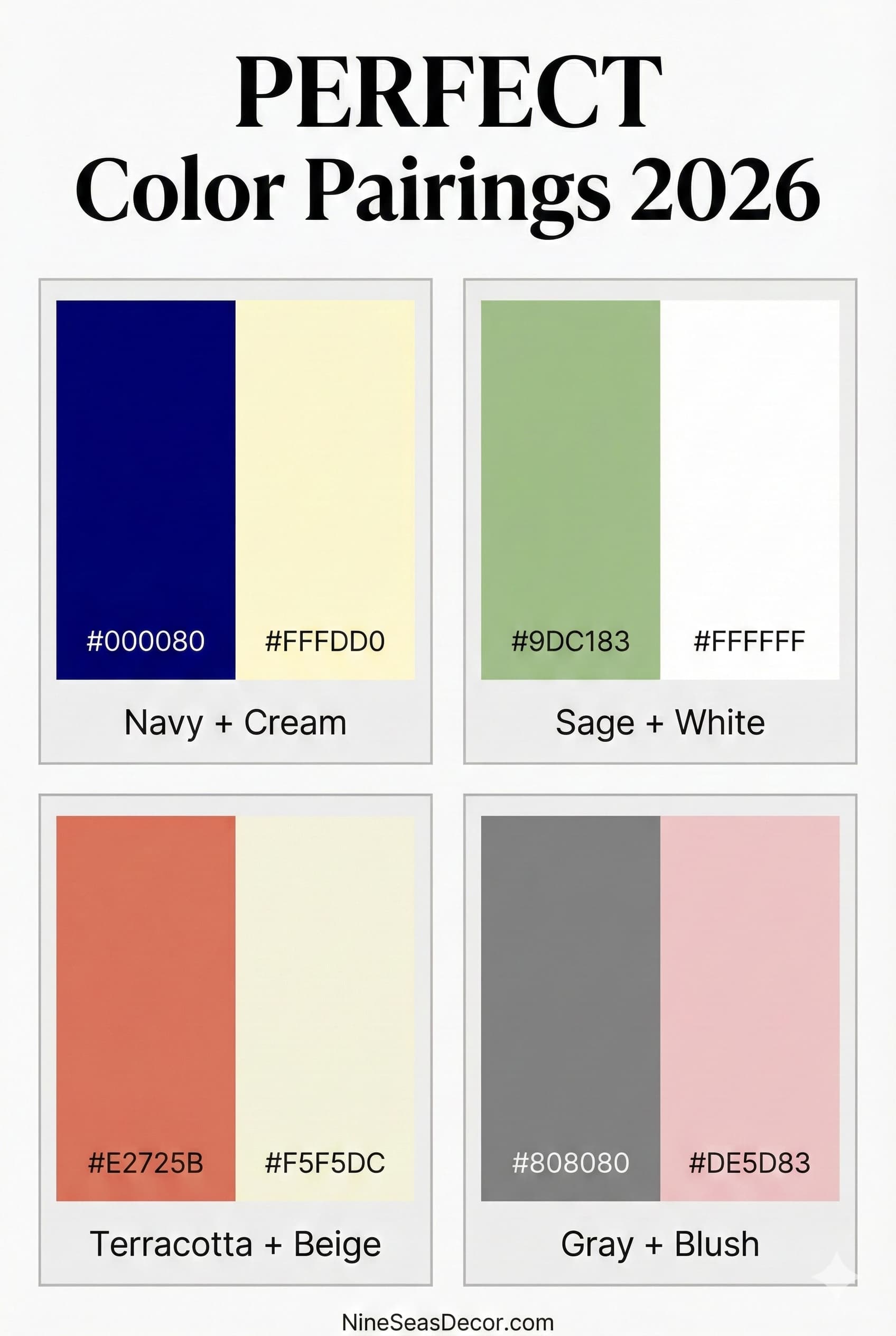
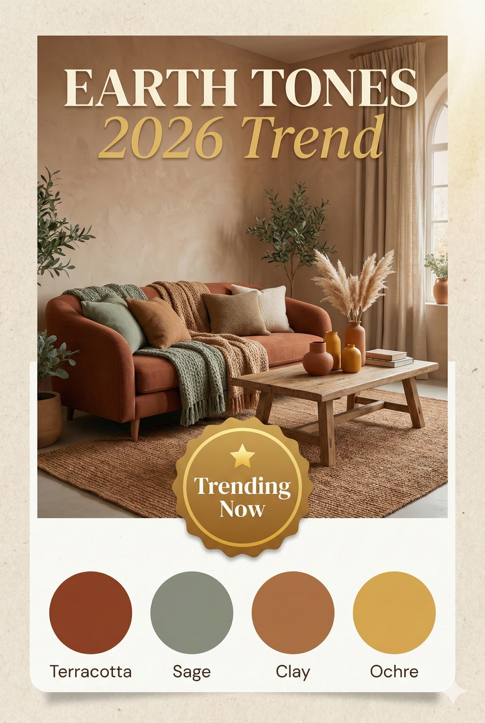
Color trends for 2026 according to Houzz design experts reflect growing desire for natural connections, warmth, and personal expression following years of cool gray minimalism. Color trends provide seasonal inspiration, though residential paint colors typically remain in place for 5-7 years according to paint industry data, making long-term preference assessment important during selection processes.
Earth tones, terracotta, rust, clay, ochre, warm browns, dominate 2026 predictions reflecting biophilic design trends and desires for grounding, natural colors reminiscent of landscapes and organic materials. These warm colors pair beautifully with natural wood, rattan, jute, and houseplants creating cohesive organic aesthetics.
Sage green and muted greens continue strong momentum from recent years, appearing in everything from wall colors to upholstery fabrics. These calming greens work as both main colors and accents, pairing with neutrals, blues, or earth tones equally well.
Warm whites and creams replace cool grays as preferred neutrals, the pendulum swings back toward warmth after years of cool Scandinavian minimalism. Expect to see more greige, warm taupe, and cream rather than stark white or cool gray.
Blush pink and dusty rose gain traction as sophisticated alternatives to traditional pinks, appearing in both paint colors and furniture choices. These muted pinks read as neutrals when paired properly, adding warmth without overwhelming femininity.
Paint finish, the sheen level from flat to high-gloss, impacts both appearance and practicality in living rooms. Different finishes reflect light differently, affect color perception, highlight or hide wall imperfections, and offer varying durability and cleanability.
Flat or matte finish provides no sheen, creating sophisticated, velvety appearance that hides wall imperfections beautifully while delivering truest color representation. However, flat paint shows scuffs easily and doesn’t clean well, best reserved for low-traffic adult-only living rooms or ceilings.
Eggshell finish, slight sheen resembling eggshells, offers best balance for most living rooms, hiding minor imperfections while providing some washability. This most popular finish works well on walls receiving moderate wear, cleaning better than flat without showing every flaw like glossier finishes.
Satin finish provides subtle sheen reflecting gentle light, offering good durability and easier cleaning than eggshell, ideal for high-traffic living rooms with children or pets. Satin highlights wall imperfections more than eggshell, requiring better surface preparation but rewarding with superior cleanability.
Semi-gloss and gloss finishes work best on trim, molding, doors, and built-ins rather than walls, providing durable wipeable surfaces that withstand wear while creating attractive contrast against flatter wall finishes. These reflective finishes make colors appear slightly lighter and more vibrant than flat versions.
Living room color schemes establish foundational atmospheric conditions supporting various residential functions including family gathering, formal entertaining, and personal relaxation. Selection processes require evaluating actual usage patterns, existing architectural elements, natural light exposure, and functional requirements.
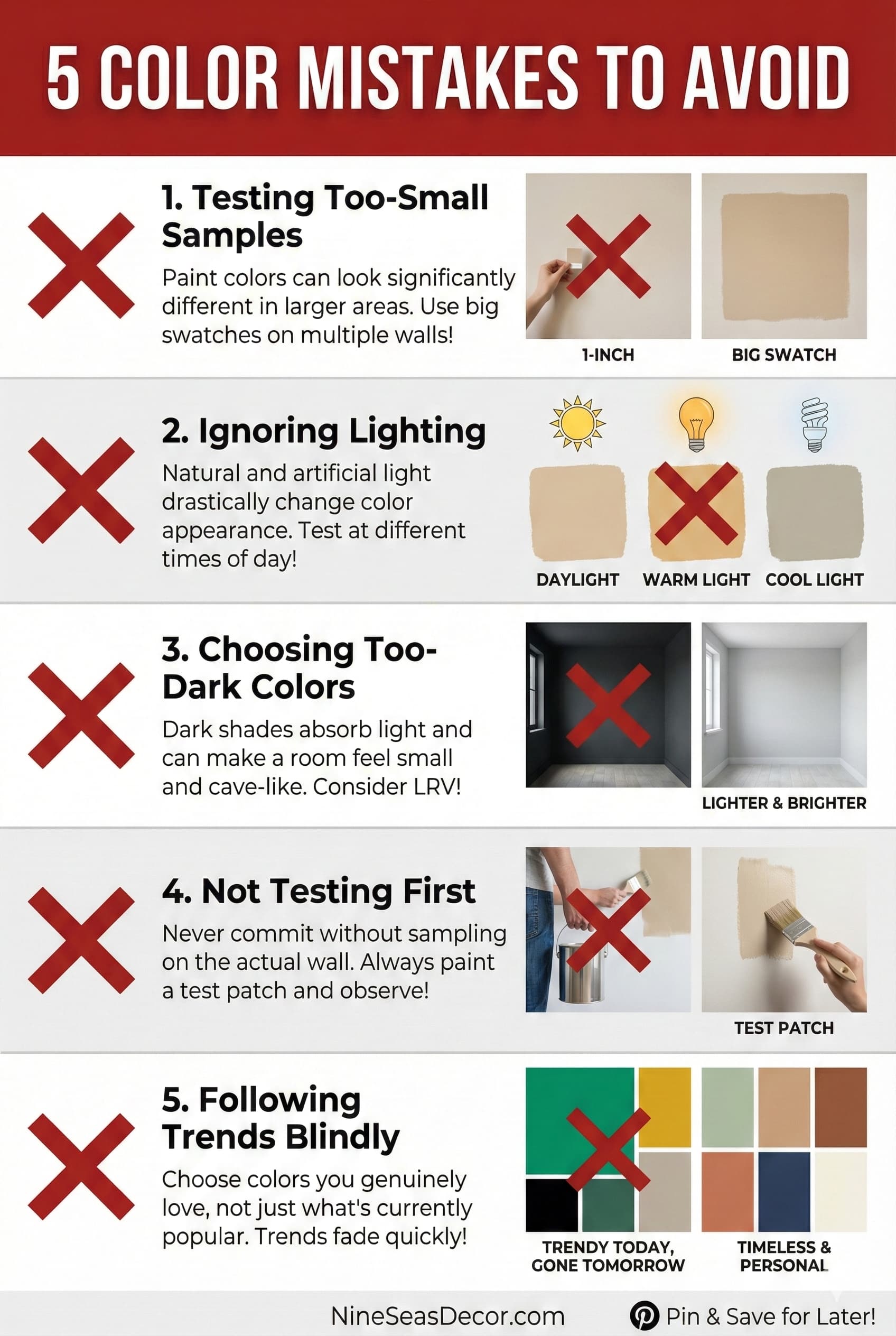
Research methodologies for color selection include testing sample applications measuring minimum 2×2 feet on multiple wall surfaces, observing color appearance variations throughout 24-hour periods under different lighting conditions, and documenting psychological responses during extended exposure periods spanning 3-7 days.
Color selection affects perceived spatial dimensions through established optical principles. Light colors measuring L values above 80 in CIE LAB color space reflect 60-80% of incident light, creating expansive spatial perceptions in rooms measuring under 200 square feet. Dark colors with L values below 40 absorb 70-85% of incident light, producing intimate atmospheric conditions in larger spaces exceeding 300 square feet.
Professional color coordination requires analyzing existing furniture undertones, flooring materials, and permanent architectural elements including molding, built-ins, and fireplace surrounds. Color schemes demonstrating undertone consistency (warm undertones throughout, or cool undertones throughout) produce harmonious visual results according to interior design research.
Successful living room color schemes align with documented residential usage patterns, reflect individual aesthetic preferences verified through testing procedures, and create atmospheric conditions supporting intended functional requirements. Evidence-based selection methodologies combining color psychology research, standardized paint color systems, and systematic testing protocols produce residential environments meeting both functional and aesthetic objectives.